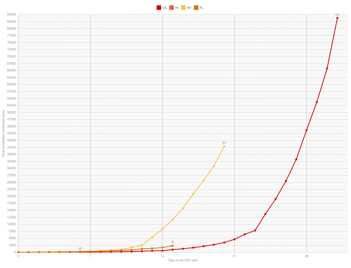
Charting Hawaii, New York, Florida, Japan and Italy: how do we compare?
These charts come from https://covid19chart.org/ written by David Bau. The chart is set so that day 0 on the x-axis takes place when the state has 25 or more cases. On the homepage link, the scale is linear. This is normally how data are depicted. However, for the chart above, the scale is logarithmic. This scale is used because pandemic cases increase exponentially. Note that the bottom 1/4 of the chart represents 100 cases. The next 1/4 represents an additional 900, and the 1/4 above that represents 9000.
For the first four days, Hawaii increased at approximately the same rate as Florida. Beginning on day 5, the curve began to flatten. It is too early to credit government intervention (i.e. shelter-in-place and travel restrictions) for this shift. However, if we can maintain this pace, we have an excellent chance of keeping our local resources under control. This is necessary as needed resources are currently in short supply worldwide and we do not have a means for procuring them.
It is important to note that Japan, which took action even more quickly than Hawaii, still experienced exponential growth. By day 42, their 25 cases had grown to 1,000.
Friends, let’s remain exceptionally vigilant in controlling the spread of this disease.
